While a brand is really so much more than a logo, we dedicate this post to our top ten favourite logos created in 2016. Take a browse and learn more about some great businesses and organizations too!
1. Beltline Neighbourhoods Association
Calgary’s Beltline Neighbourhoods Association is a new organization rooted in history. One of the most defining aspects of the community (and the reason for its name) is the former streetcar route that passed through it. The “tracks” in the logo are incorporated into the B and the typeface reminds us of the those used on streetcar and platform signs in the early 20th-century.
2. Solar Now
Solar power could become the world’s top electricity source by the middle of this century, analysis from the International Energy Agency shows. By putting solar energy systems in high-profile public spaces,Solar Now aims to spark a conversation about how British Columbians can benefit from switching from fossil fuels to solar-powered electricity. This brand makes use of clean typography and simplified solar panel imagery.
3. Intervene Design
Intervene Design works with organizations that rely on good ideas to survive. They design reality checks that both assess where an innovation is likely to fail and disturb existing systems to support future implementation. Their new brand synthesizes, in graphic form, what an intervention may look—and feel like.
4. 3 Things for Canada
Inspired by Mayor Nenshi and 3 Things for Calgary, 3 THINGS FOR CANADA asks all Canadians to give three acts of service in honour of Canada’s 150th birthday in 2017. The brand we developed is warm and inviting with a little of that Canadiana feel. It was applied to a website, and some other fun materials, like a postcard and button.
5. The Writing Department
The Writing Department is “Calgary’s premier writing agency” whose writers are experts in all forms of content creation and storytelling. With this logo design, we wanted to evoke the stylings of the 1950s and 60s, specifically the office culture of bureaucracies and institutions. The brand is characterized by a minimal typographic aesthetic that is offset by warmly coloured vintage photography.
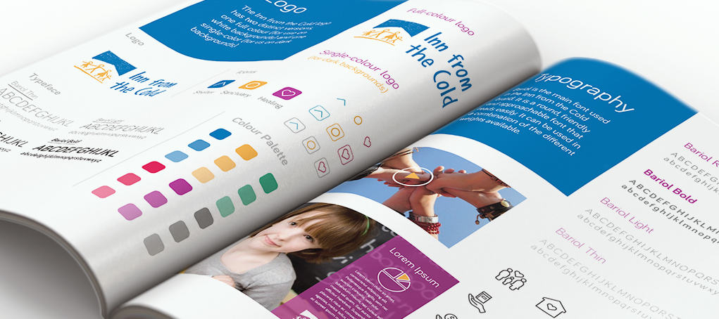
6. Inn From the Cold
Inn From the Cold‘s mission is to provide shelter, sanctuary and healing to assist homeless children and their families achieve independence. The organization engaged GOOD Company to help it begin a transition to a new brand. While there is not actually a new logo to show for it, we developed everything else around it: colour palettes, symbols, font recommendations—to compliment the characteristics of the existing logo, and form a foundation for a new logo, when the time comes.
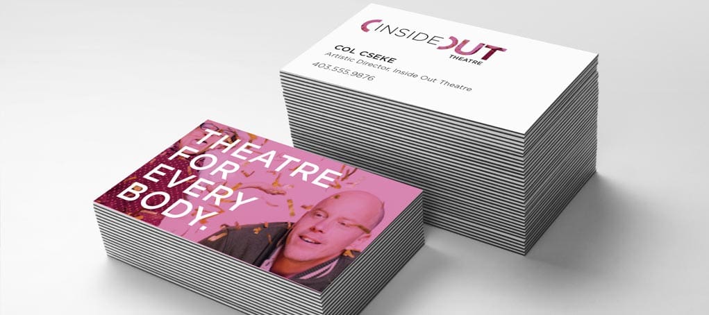
7. Inside Out Theatre
Offering classes to adults with disabilities, Inside Out Theatre fosters a transformation from the inside, out. This logo uses typography to convey the meaning of those words. While it’s simple, it’s also dynamic thanks to the use of mixed typographic weights and sizes. In some applications, the word “out” is cut away to reveal what’s beneath, creating interest and revealing telling imagery.
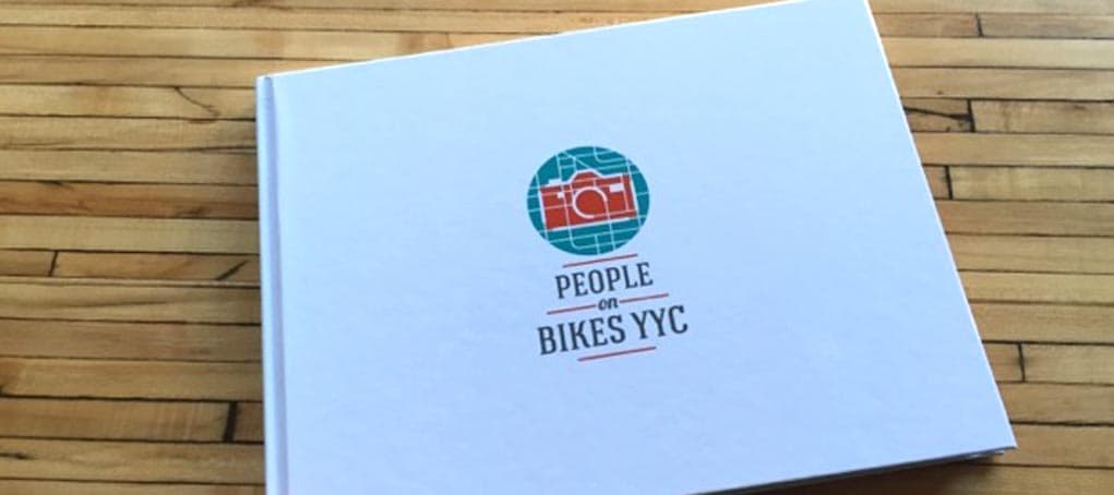
8. People on Bikes YYC
After we created graphics for the cycle track network campaign, we came up with this sub-brand for People on Bikes YYC, telling the story of people who ride bikes in Calgary – one snapshot at a time–through Instagram.
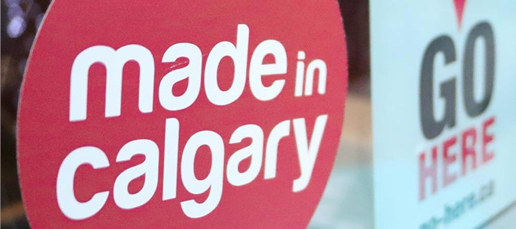
9. Made in Calgary
The “spot the dot” campaign from Made in Calgary is all about drawing attention to products and services coming out of Calgary, fostering pride and supporting local businesses. We created a logo for “Launch” the project that developed this campaign, and then this simple word mark sticker, which you may have seen around the city.
10. Dave Kelly Live
Hosted by Dave Kelly, this is a unique live show experience, packed with performances, conversations and stories that tell the story of our great city. Our brand carries a personality and tone often associated with late night variety shows.