Juice Because
Visual identity + packaging + collateral
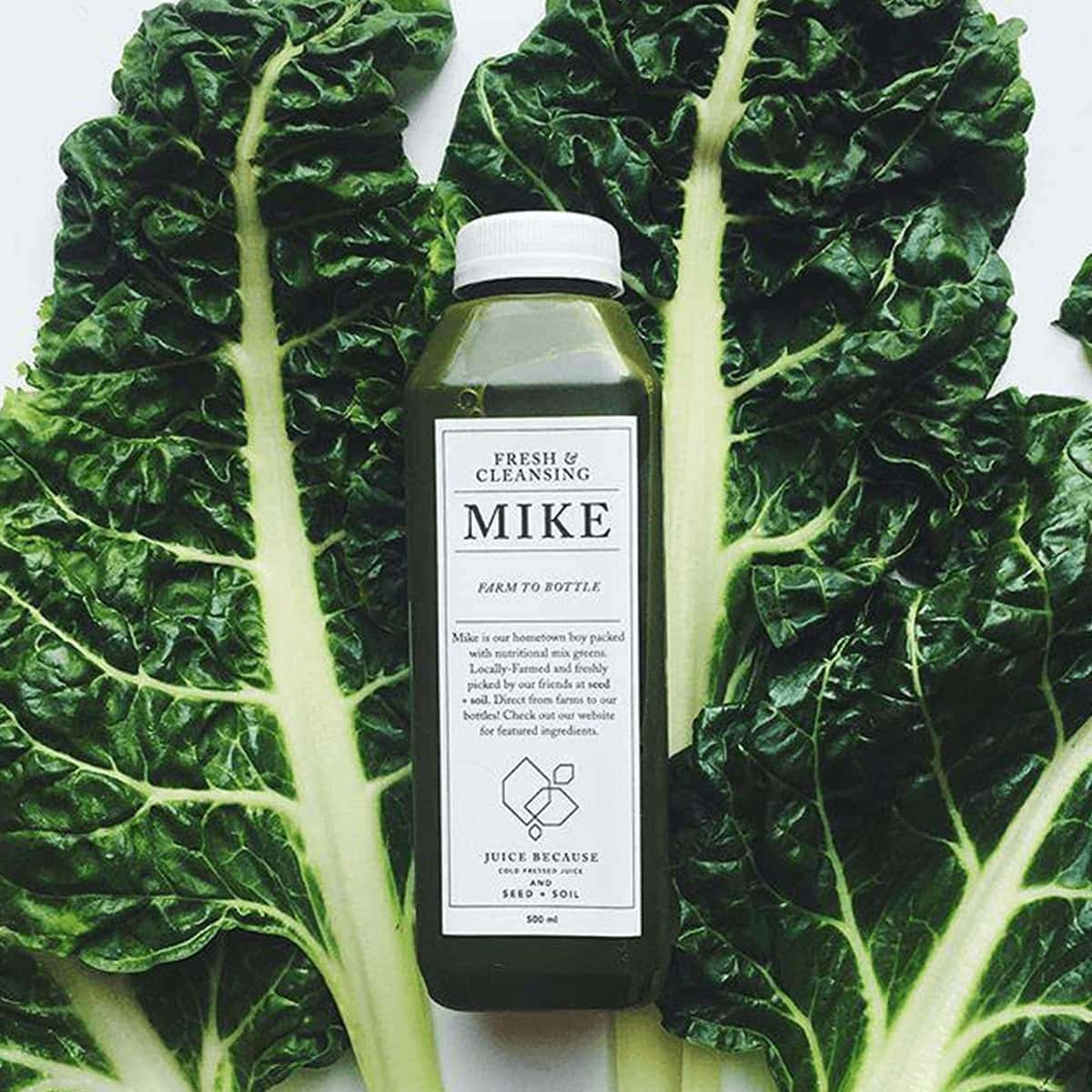
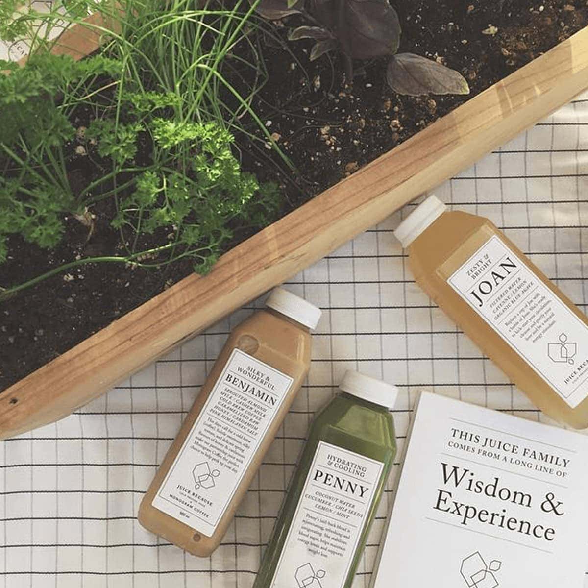
Both understated and high-impact in its black and white aesthetic, this branding project for a cold-pressed juice company, Juice Because, allows the vibrant colour of its juice to capture the customers’ attention while reinforcing its brand values of a clean, healthy lifestyle and a fresh and healthy product.
A lemon is known for its cleansing and restorative health properties, so we thought it an apt symbol to convey the benefits of the juices and form the basis of the logo. We like the openness and flexibility to this shape as well as its potential for patterning.
Juice Because is highly expressive, and one of the most prominent aspects to this brand is its ability to capture and describe its juice creations in engaging writing. For us, that meant that the overriding focus had to be on the typography. And because of that, we decided to utilize a single font family to carry the vast majority of the copy, or else risk an impression that felt cluttered and confusing. The key was in how to make use of the various weights and nuances of a single font family in order to distinguish the different sections of text, yet be uniform enough that the overall experience was charming and approachable.
We adore how Juice Because internalized this identity with engaging photography and fantastic social content.


